One of the keys to successful commercial design is understanding your audience. If you find yourself working on a design whose target audience will be mostly women, you may need some ideas on how to make it more “feminine.” In commercial design, your concepts should draw the eye of the viewer and strengthen the delivery of a message. For female audiences, feminine design is more appealing, more effective, and better suited for the purpose.
So, what makes a design feminine? Can you really design something that is naturally attractive to the female eye? With the right fundamentals applied, anyone — even those of the more macho persuasion — can successfully design for a female audience.
Keep in mind that preferences change between different cultures and age groups. For example, we tend to associate bright pinks and purples with very young women, while deeper shades of red and purple are usually chosen for adult women. As with any design, make sure that you have a clear understanding of your audience and keep that specific audience in mind throughout your designing process.
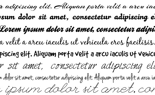
Use Script or Handwritten Typography

Scripted or handwritten fonts can lend a feminine touch to any design. Of course, use these fonts carefully. Not every design element should be adorned with scripts. Instead, focus on titles or headings, and leave the body text in easy-to-read fonts — typically a simple serif or sans-serif. Also, bear in mind that fonts you choose may not be immediately usable on the web.
Choose Diverse, Bright Colours

Why not talk to us if you need help designing your new website. Contact us today!
